Flyout Menus/Mega Menus - Components
🌻 What happened there?
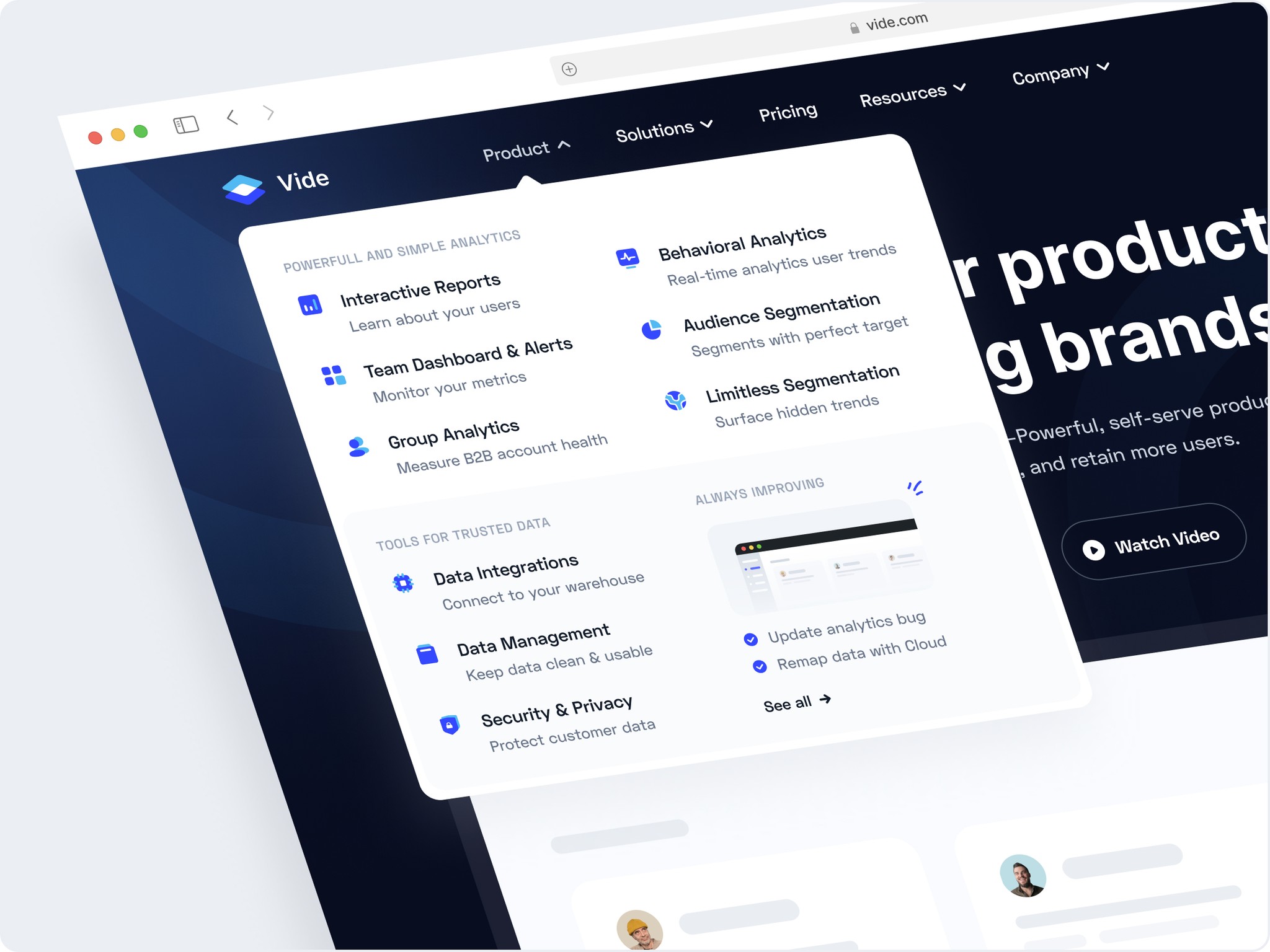
Vide is an exploration of an analytics tool inspired by Mixpanel.com. In this exploration, my main focus was on the flyout menu in the navigation bar. I was truly impressed by how Stripe displays their flyout menu, and I felt inspired to create a similar exploration.
The impression I want to convey on this landing page is a playful style but character. I combined purple and cyan colors to create a playful vibe, and I added background ornament lines to add a strong character. I did this to make the landing page a bit different and give it a unique identity.
🤩️ Custom Icon and Figma Freebies
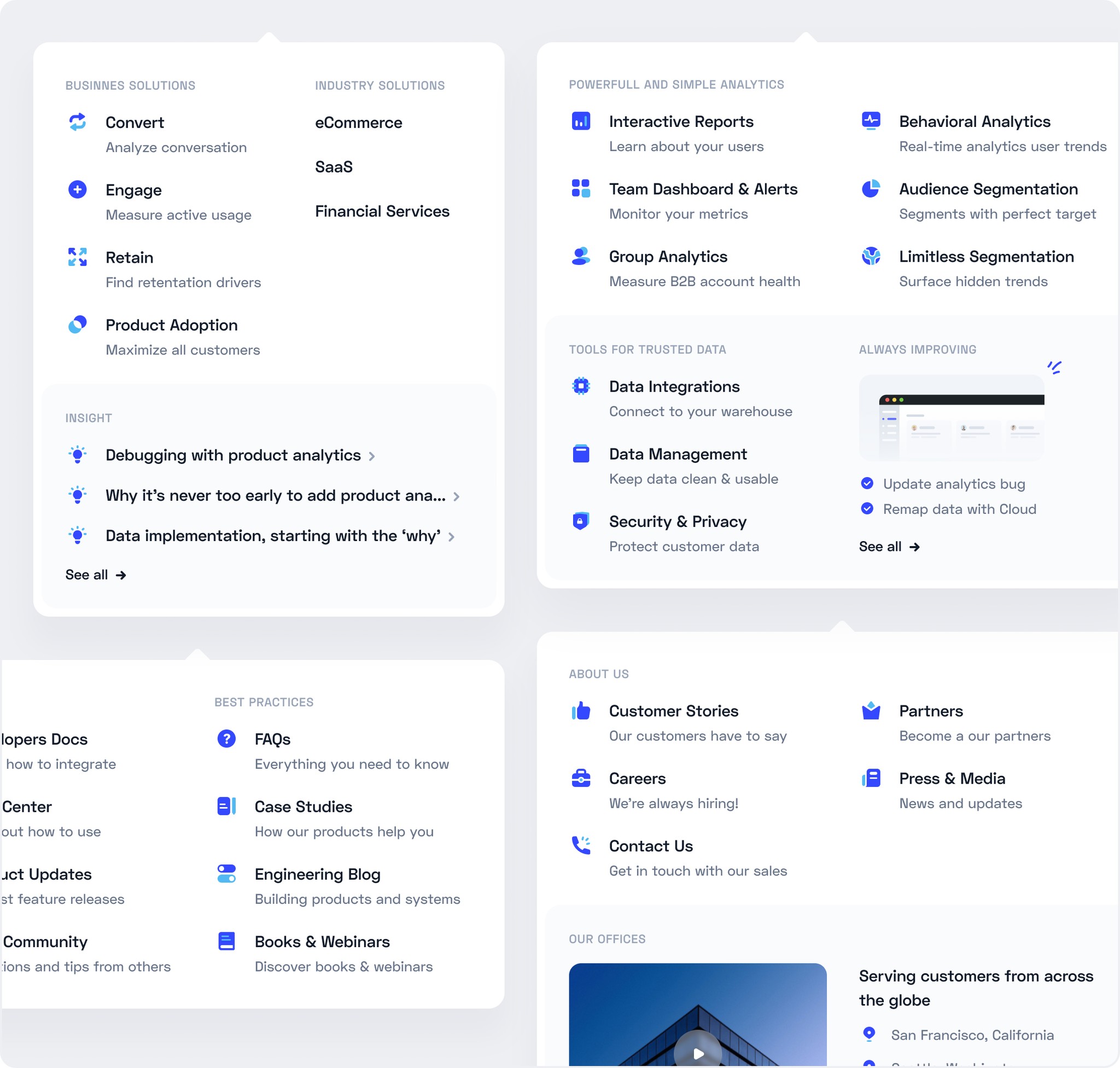
The cool design on Stripe has been a huge source of inspiration for me, especially in icon design. I've also been learning how to create icon designs. It's been quite challenging and engaging, but I'm pretty satisfied with the playful look of the icon designs I've created and looks that harmoniously align with the website's style.
Additionally, in this exploration, I wanted to give back to the Figma community, so I uploaded it as a Free file that can be used as a reference or studied by other designers. They can duplicate it here for their own use.

How? Interesting?
Let’s collaboration and have fun 🙌
Contact

Flyout Menus/Mega Menus - Components
🌻 What happened there?
Vide is an exploration of an analytics tool inspired by Mixpanel.com. In this exploration, my main focus was on the flyout menu in the navigation bar. I was truly impressed by how Stripe displays their flyout menu, and I felt inspired to create a similar exploration.
The impression I want to convey on this landing page is a playful style but character. I combined purple and cyan colors to create a playful vibe, and I added background ornament lines to add a strong character. I did this to make the landing page a bit different and give it a unique identity.


🤩️ Custom Icon and Figma Freebies
The cool design on Stripe has been a huge source of inspiration for me, especially in icon design. I've also been learning how to create icon designs. It's been quite challenging and engaging, but I'm pretty satisfied with the playful look of the icon designs I've created and looks that harmoniously align with the website's style.
Additionally, in this exploration, I wanted to give back to the Figma community, so I uploaded it as a Free file that can be used as a reference or studied by other designers. They can duplicate it here for their own use.


How? Interesting?
Let’s collaboration and have fun 🙌
Contact


Flyout Menus/Mega
Menus - Components
🌻 What happened there?
Vide is an exploration of an analytics tool inspired by Mixpanel.com. In this exploration, my main focus was on the flyout menu in the navigation bar. I was truly impressed by how Stripe displays their flyout menu, and I felt inspired to create a similar exploration.
The impression I want to convey on this landing page is a playful style but character. I combined purple and cyan colors to create a playful vibe, and I added background ornament lines to add a strong character. I did this to make the landing page a bit different and give it a unique identity.


🤩️ Custom Icon and Figma Freebies
The cool design on Stripe has been a huge source of inspiration for me, especially in icon design. I've also been learning how to create icon designs. It's been quite challenging and engaging, but I'm pretty satisfied with the playful look of the icon designs I've created and looks that harmoniously align with the website's style.
Additionally, in this exploration, I wanted to give back to the Figma community, so I uploaded it as a Free file that can be used as a reference or studied by other designers. They can duplicate it here for their own use.


How? Interesting?
Let’s collaboration and have fun 🙌
Contact


