Admin Sales Dashboard Exploration
🌻 What happened there?
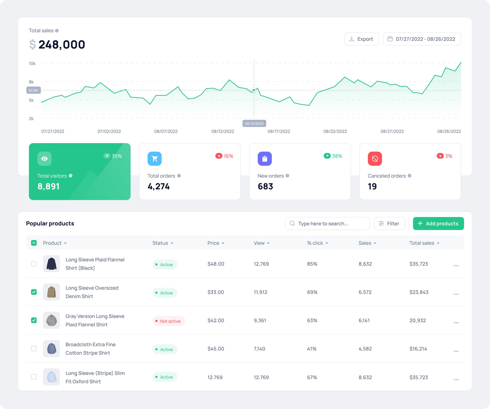
Chaps is basically an exploration of an admin sales dashboard. Here, an admin can check out live stats, sales data, stock levels, and some handy features. When I put this together, I took inspiration from Intercom and Shopify.
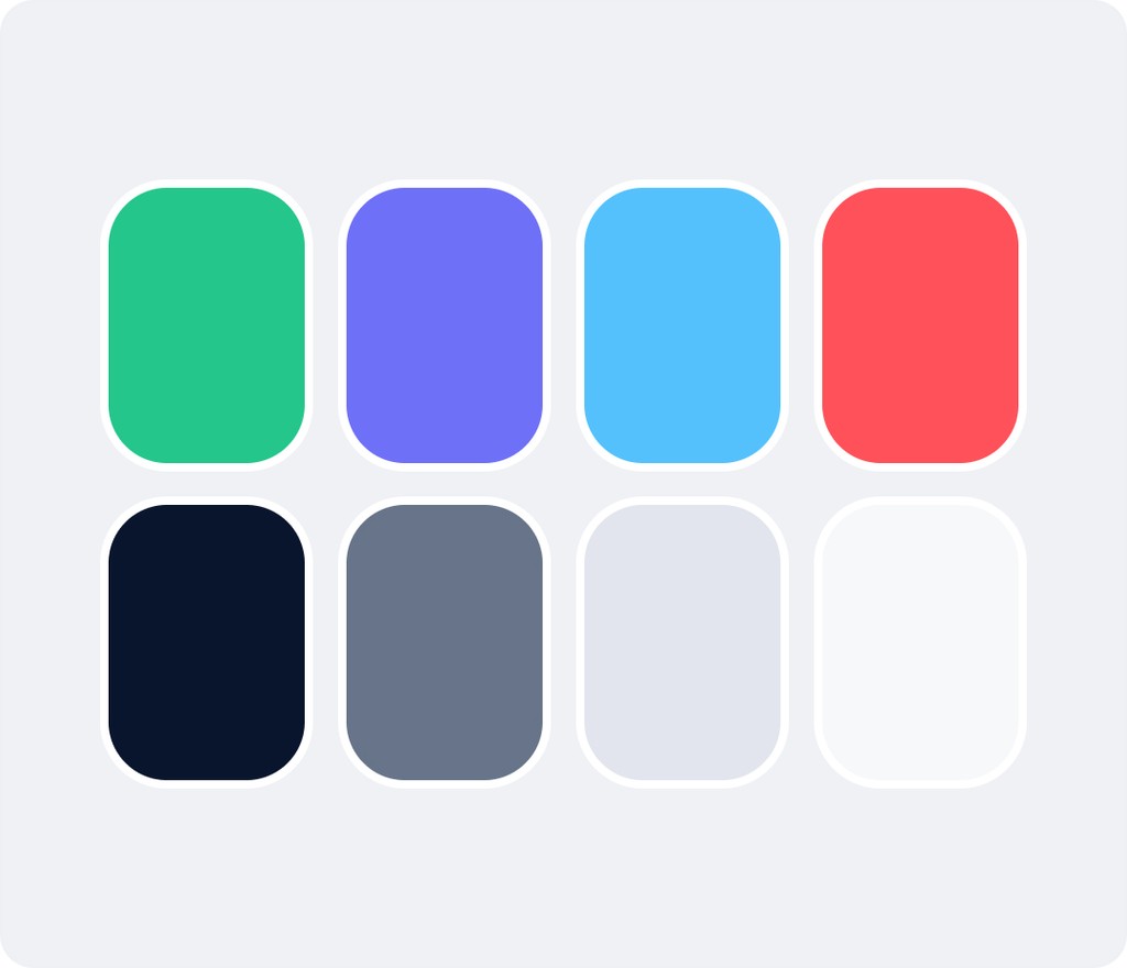
I went for a mix of black, white, and green as the main colors. Using green as the primary color is all about giving off a positive and growth-oriented vibe, according to color psychology.

✍️ Interaction
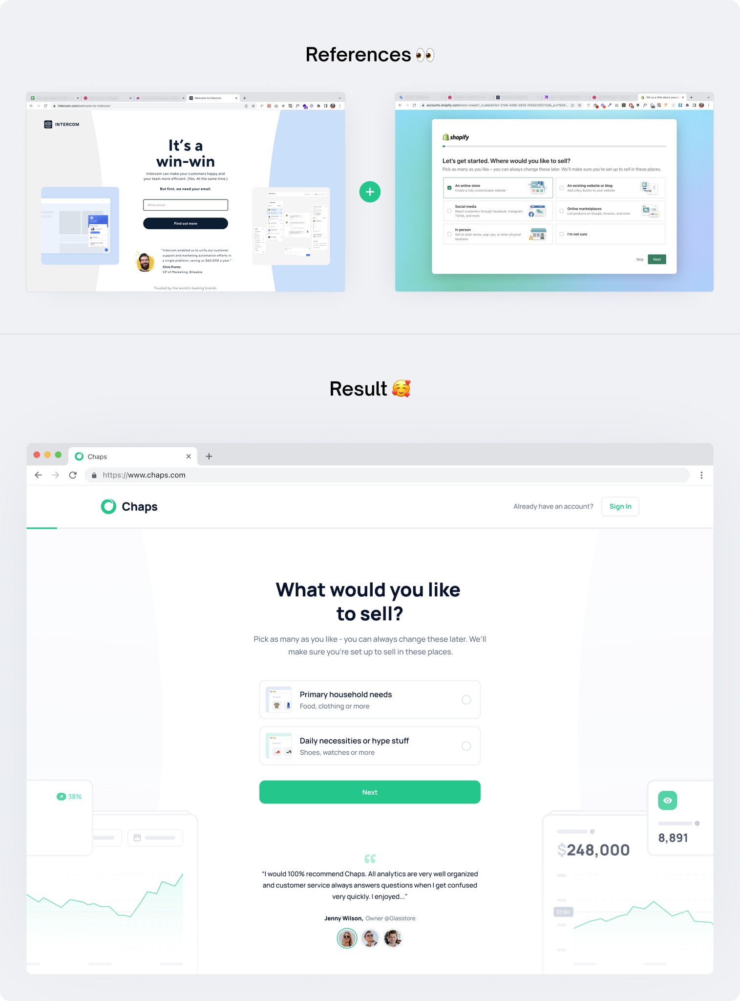
The interaction I focused on in this dashboard occurs during the onboarding phase or when new users have just signed up. My main source of inspiration for this was Shopify. Personally, I find the user onboarding phase quite exciting, and I felt really happy while designing it because it presented an interesting challenge.
I blended the styles of Intercom and Shopify for the onboarding process, aiming for a clean and engaging look. I wanted to create an appealing onboarding experience that would leave users with a positive first impression.
How? Interesting?
Let’s collaboration and have fun 🙌
Contact

Admin Sales Dashboard Exploration
🌻 What happened there?
Chaps is basically an exploration of an admin sales dashboard. Here, an admin can check out live stats, sales data, stock levels, and some handy features. When I put this together, I took inspiration from Intercom and Shopify.
I went for a mix of black, white, and green as the main colors. Using green as the primary color is all about giving off a positive and growth-oriented vibe, according to color psychology.


✍️ Interaction
The interaction I focused on in this dashboard occurs during the onboarding phase or when new users have just signed up. My main source of inspiration for this was Shopify. Personally, I find the user onboarding phase quite exciting, and I felt really happy while designing it because it presented an interesting challenge.
I blended the styles of Intercom and Shopify for the onboarding process, aiming for a clean and engaging look. I wanted to create an appealing onboarding experience that would leave users with a positive first impression.
How? Interesting?
Let’s collaboration and have fun 🙌
Contact


Team Collaboration Website Exploration
🌻 What happened there?
Chaps is basically an exploration of an admin sales dashboard. Here, an admin can check out live stats, sales data, stock levels, and some handy features. When I put this together, I took inspiration from Intercom and Shopify.
I went for a mix of black, white, and green as the main colors. Using green as the primary color is all about giving off a positive and growth-oriented vibe, according to color psychology.


✍️ Interaction
The interaction I focused on in this dashboard occurs during the onboarding phase or when new users have just signed up. My main source of inspiration for this was Shopify. Personally, I find the user onboarding phase quite exciting, and I felt really happy while designing it because it presented an interesting challenge.
I blended the styles of Intercom and Shopify for the onboarding process, aiming for a clean and engaging look. I wanted to create an appealing onboarding experience that would leave users with a positive first impression.
How? Interesting?
Let’s collaboration and have fun 🙌
Contact


